
Building responsive websites is hard. You design for desktop, check mobile, tweak tablet, and repeat endlessly. Responsively changes that by letting you see all devices at once - in real-time.
Free & Open-Source
Test unlimited devices simultaneously with zero cost. Available for Windows, Mac, and Linux.
See All Devices at Once
Instead of resizing your browser or switching between device emulators, Responsively shows you phone, tablet, and desktop views side-by-side:
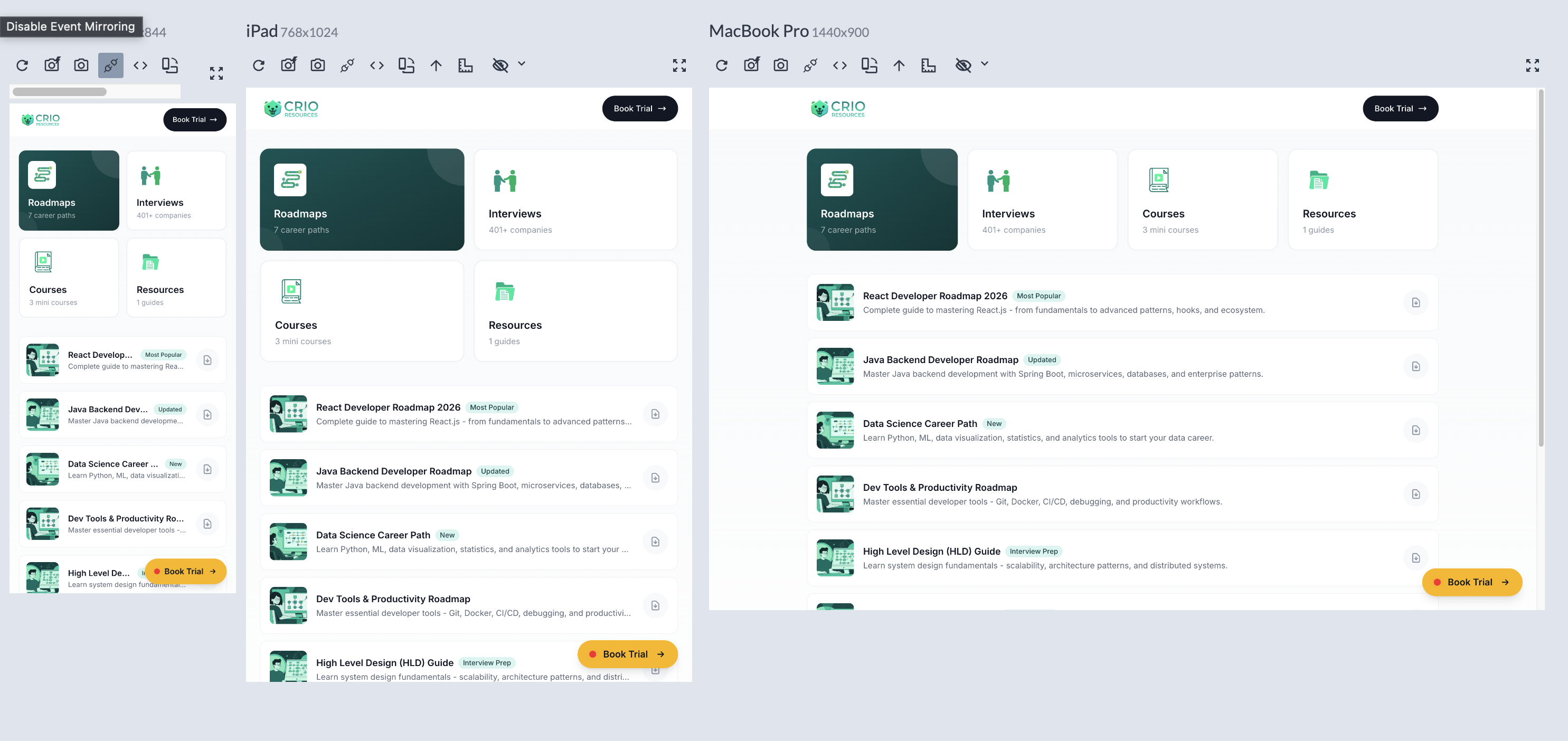
Responsively displaying a website on phone (390px), iPad (768px), and MacBook (1440px) simultaneously
Key Features
Multi-Device Preview
View 30+ device profiles including iPhone, iPad, Android, and desktop screens - all at once
Synchronized Interactions
Scroll, click, and type on one device - all others follow. Spot responsive bugs instantly
DevTools Built-in
Inspect elements and debug CSS directly within the app - no context switching needed
Screenshot Capture
Export screenshots of all devices for documentation, client presentations, or bug reports
Device Previews
Here's how a responsive website looks across different screen sizes:

iPhone 12 Pro
390 x 844
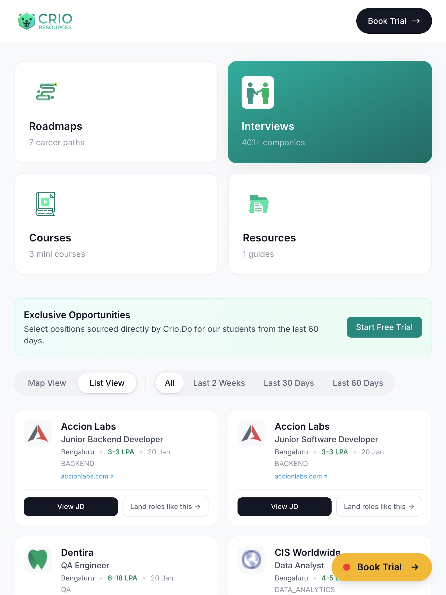
iPad
768 x 1024
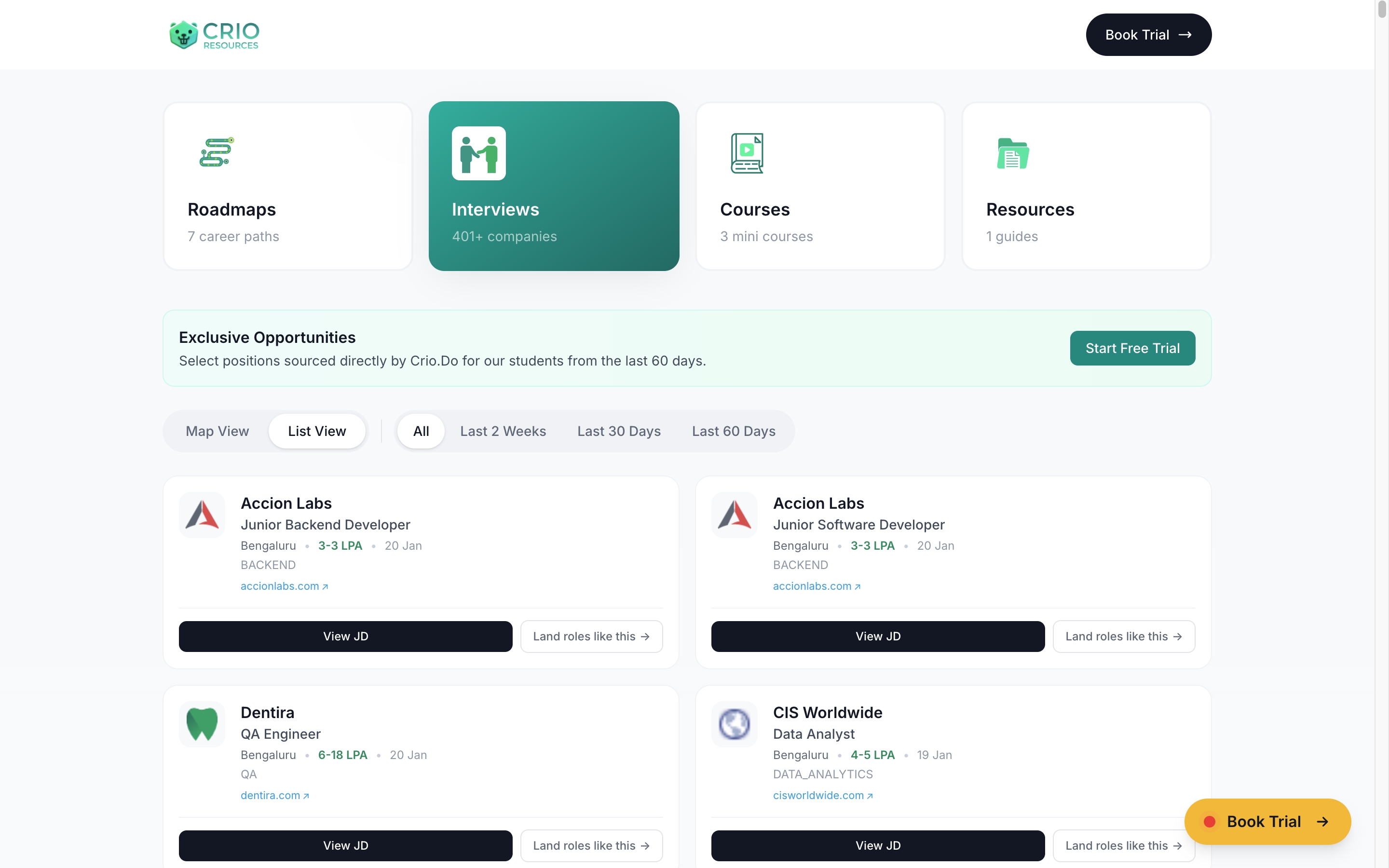
MacBook Pro
1440 x 900
Why Developers Love It
- ✓ Save Hours of Testing Time - No more resizing browser windows or switching between emulators
- ✓ Catch Bugs Early - See layout issues across all breakpoints while you code
- ✓ Hot Reload Support - Works with your dev server for instant updates
- ✓ 100% Free - Open-source, no subscriptions, no feature limits
- ✓ Works Offline - No internet required after installation
Responsive Breakpoints Cheatsheet
Bookmark these standard breakpoints for your CSS media queries:
| Breakpoint | Width | Devices | Tailwind |
|---|---|---|---|
| Mobile S | 320px | iPhone SE, older phones | default |
| Mobile M | 375px | iPhone 12/13/14 | default |
| Mobile L | 425px | iPhone Plus, large Android | default |
| Tablet | 768px | iPad, tablets | md: |
| Laptop | 1024px | Small laptops, iPad Pro | lg: |
| Desktop | 1280px | Standard monitors | xl: |
| Large Desktop | 1536px+ | Large monitors, 4K displays | 2xl: |
Pre-Launch Testing Checklist
Before shipping, check these 10 common responsive issues across all breakpoints:
-
1
Navigation collapses properly Hamburger menu works, no horizontal overflow
-
2
Touch targets are 44px minimum Buttons/links are large enough to tap accurately
-
3
Font sizes are readable on mobile Body text at least 16px, no tiny labels
-
4
Images scale without breaking layout max-width: 100% on all images, proper aspect ratios
-
5
Forms are usable on small screens Inputs full-width, labels visible, keyboard-friendly
-
6
Modals/popups fit the viewport Scrollable content, close button accessible
-
7
Tables scroll horizontally or stack No content cut off, overflow-x-auto or responsive tables
-
8
No horizontal scrollbar on any page Check for elements wider than viewport
-
9
CTA buttons stay visible and prominent Primary actions don't get hidden or too small
-
10
Footer stacks properly on mobile Links readable, columns become rows
Pro Tips & Power Features
Level up your Responsively workflow with these lesser-known features:
Keyboard Shortcuts
Cmd/Ctrl + R- Refresh all devicesCmd/Ctrl + Shift + S- Screenshot all devicesCmd/Ctrl + I- Toggle DevToolsCmd/Ctrl + D- Add/remove device
Custom Device Profiles
Click the "+" button to create custom device profiles. Perfect for client-specific devices or unusual screen sizes. Save profiles for quick access across projects.
Bulk Screenshot Export
Capture all visible devices with one click. Great for design reviews, client presentations, or documenting responsive behavior. Export as PNG with device names.
Network Throttling
Simulate slow connections (3G, 4G) to test loading states and performance on mobile networks. Find issues before real users do.
Test with ngrok/localhost.run
Pair Responsively with a tunnel service to test on real devices. Run ngrok http 3000, paste the URL in Responsively, then open the same URL on your actual phone.
Disable Sync for Specific Tests
Sometimes you need to test scroll position or hover states independently. Toggle sync off temporarily to interact with devices separately.
Getting Started
-
1
Download Responsively
Visit responsively.app and download for your OS (Windows, Mac, or Linux)
-
2
Enter Your URL
Paste your localhost or live site URL in the address bar
-
3
Select Devices
Choose which device profiles to preview from 30+ built-in options
-
4
Start Building
Code, save, and watch all devices update automatically with hot reload
Download Responsively for Free
Stop wrestling with responsive design. See every device at once and ship pixel-perfect websites faster.
Download Now